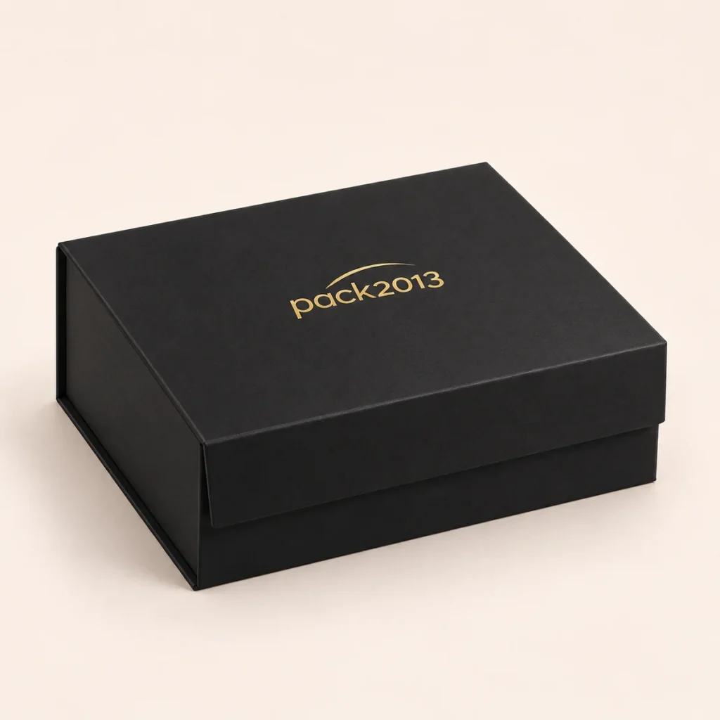
The right artwork makes it easier to reproduce your brand clearly. Start with a vector logo when available, and explain the intended print or finishing method.
Choose the finish before finalizing fine details
Printed ink, foil stamping and embossing create different effects. Fine lines, small gaps and tiny type may require adjustment depending on the material and process. Ask the supplier to review the smallest elements in your artwork.
Provide usable files
A vector PDF with outlined fonts is often a useful starting point. Keep your editable source file, identify brand color references and separate special finishes into clearly named layers. A screenshot may help explain the idea but is not necessarily production-ready artwork.
Use the matched dieline
Place artwork on the dieline confirmed for the selected structure and dimensions. Follow its bleed, safe area, cut and fold guidance. Do not reuse a template from a visually similar box without checking the construction.
Review before approval
Check spelling, logo position, orientation and finish instructions. Consider a physical sample when color, paper texture or foil appearance is important; a screen preview cannot fully reproduce these qualities.